He takes the Hi resolution map of Sea Ice Extent for the 17th of April 2012 and gets his colouring crayons out again to use a very inaccurate and unscientific method to measure the change in extent form the 1979 - 2000 average. Just like in any good comedy of errors he rather predictably gets it all wrong and the farce continues when he uses errant values support his insinuations of skulduggery. I'm certain a good comedy writer could make a whole series out of the errors and misinformation on 'Real Science'. Perhaps it could be call Goddard's Gaffs, featuring a bumbling shambolic character in front of a monitor trying to save the world from a secret shadowy cabal of men in black that don't actually exist.
Here is how Goddard gets it so wrong - again!
He takes the original map from the NSIDC web site;

And, for some reason turns it around, and gets colouring. To end up with the work of art here;

He then claims to count the red (ice loss) and the green (ice gain) and compare them. He states;
"The area of green is 3544 pixels, and the area of red is 2941 pixels."Which may well be correct, and then uses the difference, a whole 603 pixels to suggest that the sea ice extent must be that much above normal. He then presents the NSIDC graph here to say;
"The NSIDC graph should be showing Arctic ice extent slightly above normal, for the first time in nearly ten years.
Instead, the graph shows well below normal ice extent."
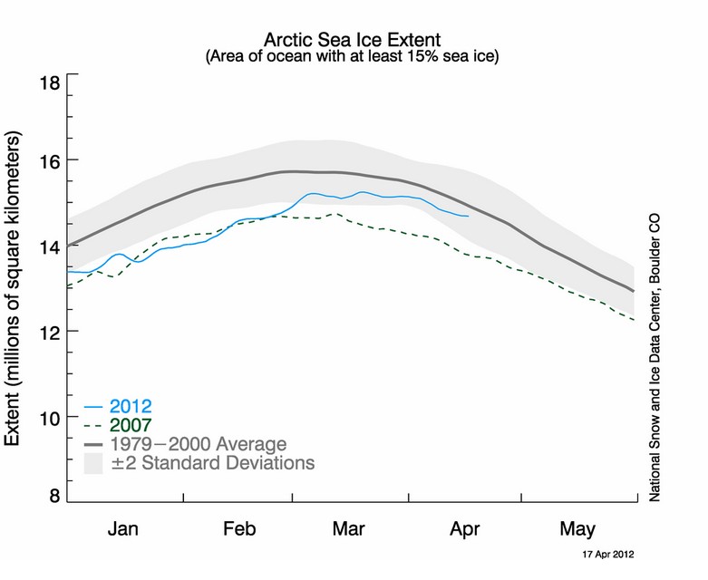
The first ting to notice is that the original image contains over 1.6 million pixels so I doubt very much if 603 pixels is going to be noticeable 'above normal'. But why isn't it showing at least normal?
Well it is all down to 2 gaffs by Goddard. The first is, like any good six year old when it comes to colouring in, they say within the lines, unfortunately they don't always reach the lines sometimes miss bits. Goddard does exactly that as can be seen here indicated by purple and yellow arrows;

To be honest this probably averages out with missing bits that should be either red or green but this is more like child's play than a 'scientific method' and he is only talking about 603 pixels after all.
The biggest error occurs due to his treatment of the orange 'extent line' itself. The NSIDC clearly indicate that the orange line in the extent image is the1979 to 2000 average extent. That means that the outside of the line is the outside of the extent and should be included as red in every red area. Goddard doesn't bother about any such details.
How much difference can such a thin line really make to Goddard's pixel count if he had done it correctly? When zoomed in on the original NSIDC image the orange line is about 5 pixels wide and it will be thousands of pixels long. That is many thousands of pixels that should have been included and would have offset Goddard's mighty 603 pixels 'above normal' even if he had done his colouring to the lines correctly.
Have a look at WUWT, numpty. NSIDC have admitted to an oops.
ReplyDeleteCorrection, then? Me thinks not.
Correct what? Goddard can't colour in - that is a fact that needs no correction.
ReplyDelete